Personal Project
2022
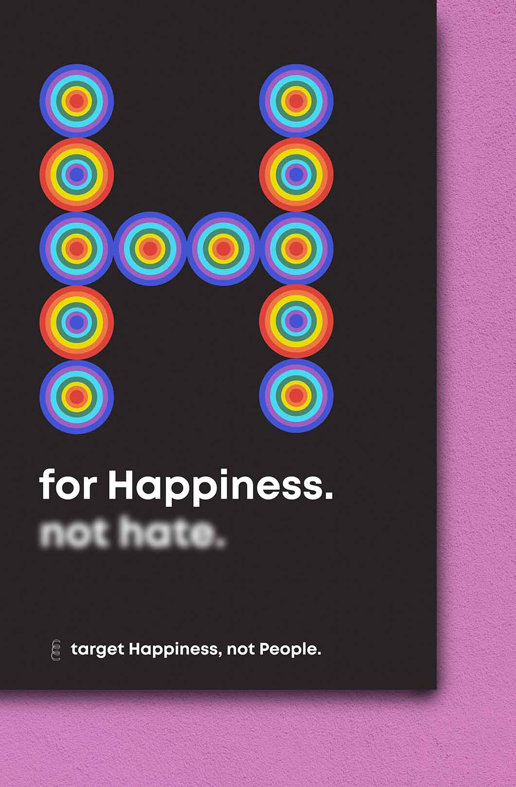
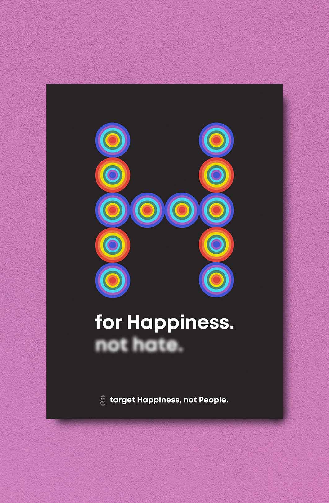
H for Happiness
Poster design regarding the pride day. Unfortunately, we still need to remind others that we are all humans. Humans should not be targeted for the choices they make. We should all rather focus our energy on targeting happiness instead.
Don’t you agree? :)
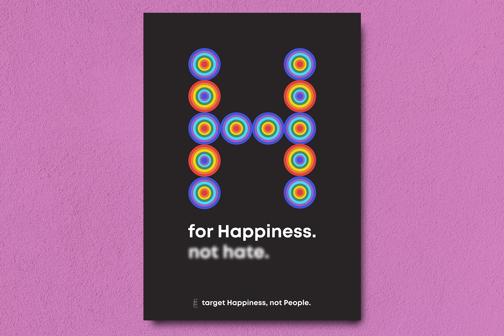

Focus on happiness, not hate.
You can only achieve what you focus on.
The target symbol has the pride colors to make an analogy of how LGBTQ+ are constantly targeted. The ideia here is to present an alternative target, a good one — Happinness, rather than hate against minorities. Both words start with the letter H. That is why graphically the focus is on happiness and the target symbols are forming an H for hapinness, not hate.
So there are two main messages:
H for Happiness, not hate
+
Targe Happiness, not people.
+
Targe Happiness, not people.